In a recent post I wrote about why your Facebook adverts are not working, I left out an important piece of information – the 20% text rule! It’s something widely known and understood by all digital marketers but if you’re a small business owner going the DIY route then this is something you need to be aware of.
A few months ago, whispers about a test that would change the way brands advertise on Facebook started circulating industry blogs. Rumor had it the social network was considering doing away with the “20% rule” regarding the amount of text allowed on ad images. It has been a very frustrating problem for many advertisers who rely on text in their adverts to really drive home their message and sell their products. Until recently, Facebook advertisers were allowed to cover their ad images with no more than 20% text. To adhere to guidelines, those who paid for reach on the platform were forced to use a tool developed by Facebook that divided ad images with a 25-rectangle grid (it’s since been replaced with a different tool, but more on that later). If your text took up more than 20% of the rectangles, the ad wouldn’t be allowed to run.
So, what’s the big deal about text on adverts anyway?
I don’t know about you, but when I log onto Facebook I don’t want it to feel like a classifieds section of a newspaper. I don’t mind adverts, I actually enjoy them (targeted ones). But when I feel like I am being constantly sold to, I am definitely not going to be happy. Also, our news feed is already very noisy and saturation is needed. When any of Facebook’s 1.65 billion users log into the platform, their networks share an average of 1,500 stories per day. That’s 1,500 posts the social network’s algorithm has to prioritize in your news feed. You don’t get to decide to what you see, Facebook’s algorithm does. And somewhere in there it needs to make room for advertisers. That’s when text overlay on ad images comes into play.
Adverts with text have been proven by research to not perform better. The SketchDeck team had a guess why:
“We think the ads with text overlaid looked, well, like ads. Users saw the text or call to action, registered it as an ad and then moved on. One of Facebook’s tips is that an ad image should not look out of place in the news feed. And not many users are plastering text across the images that they posts.”
Not long ago, Facebook Product Marketing Manager, Afsheen Ali, reached out to Jon Loomer to officially address the rumors regarding the 20% text rule:
“Our research has shown that people demonstrate a preference for ads with less text. Previously, if 20% of an ad image’s area was text, it was not approved to run on Facebook, Instagram or the Audience Network. We’ve heard from some advertisers that this can be confusing, as it’s not always clear that an ad does not meet the policy requirements until after creative has been submitted. We are shifting to a new solution to improve this experience which allows advertisers more flexibility while still allowing us to maintain an enjoyable experience for people.”
What does this mean for you?
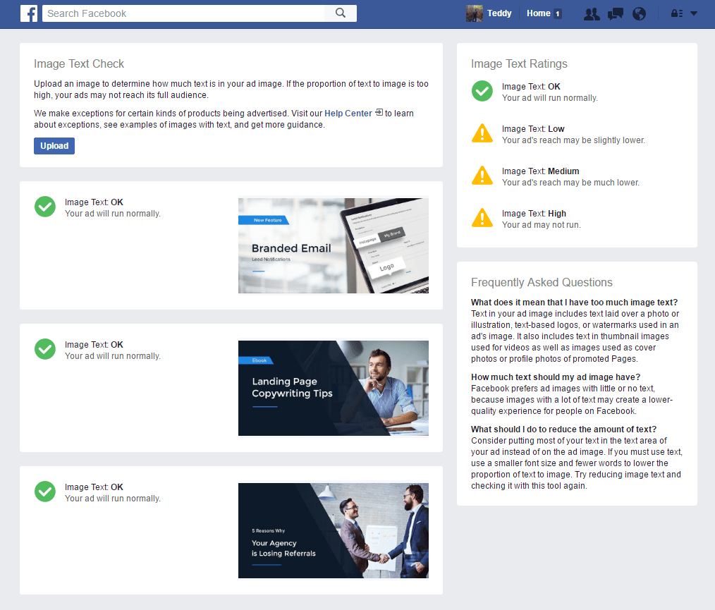
Design compelling adverts without or very limited text! It’s simple. Make sure your headline and description captivates the users attention and use images that aren’t common but fun. Use this free tool from Facebook to upload an image to determine how much text is in your advert image. If the text-to-image ratio is too high, your adverts may not fully reach their audiences. What’s been your experience with the new rule? Have you followed it? Have you seen reach decrease with more text overlay?